A note on the public preview
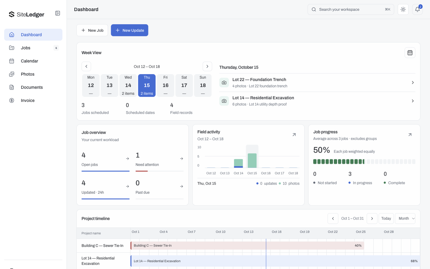
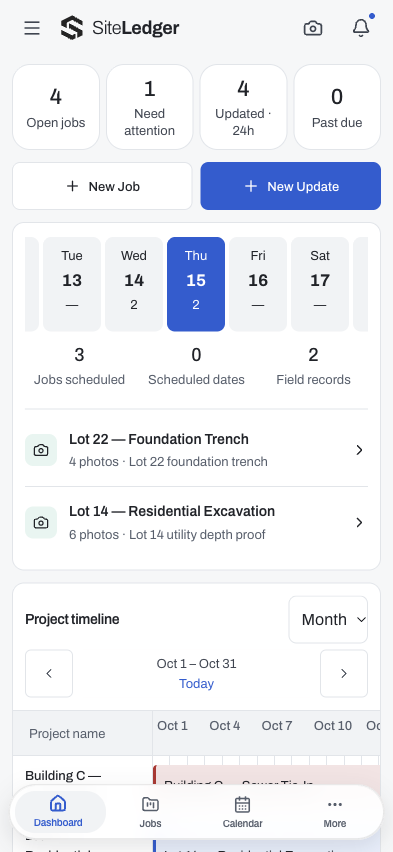
The araNET showcase pairs SiteLedger’s desktop and mobile dashboard captures from the October 15 preview update. The imagery uses fictional demo jobs and sample records, alongside the approved Structural S identity. This is a design note about those public captures, not an announcement that a new feature has been released to customer accounts.
The product’s focus is the connection between construction field operations, project evidence and closeout. The showcase makes that relationship visible without publishing a customer’s operational or financial information.
Two screens, different priorities
The desktop capture has room for a job overview, a week view, activity and a project timeline. It supports a broad view of what needs attention. The mobile capture brings the same product context into a narrower layout where information must be prioritized rather than simply reduced in size.
Three decisions make these October 15 examples useful to compare:
- Summary before detail: the desktop overview groups jobs and attention items before the timeline. This helps a planner decide which record deserves a closer look, but the totals need a route back to their underlying records.
- Dates beside activity: the week view and project timeline give recent updates a schedule context. A status alone cannot explain whether work is on its intended date. More detail is useful only while labels and dates remain readable.
- Priority before density on a phone: the narrow capture stacks the overview and weekly context instead of shrinking a wide dashboard. That costs vertical space, but preserves a reading order a person can follow. A designer still has to check whether the important action is reachable without a long scroll.
Review the path from summary to evidence
An operations dashboard is useful only if its summaries help someone take the next appropriate step. When reviewing a product like this, ask where a status came from, what evidence supports it and who is allowed to change it. These are evaluation questions, not a claim that every path has been verified by a screenshot.
- Can someone distinguish a current status from an earlier update?
- Is there enough context to identify the correct project or job?
- Are actions appropriate to the person’s role and current task?
- Does a failed or delayed update remain understandable?
- Can the team tell what is complete and what still needs a decision?
What the showcase can and cannot establish
The captures show a visual direction and sample information layout. They do not prove offline synchronization, role enforcement, a completed native-device acceptance test or a particular customer result. Those behaviors need separate checks in the relevant product and environment.
For a prospective operations build, the useful takeaway is to bring one real workflow and a public-safe example of its records. Trace how information moves from capture to review to closeout. That gives design and development something more concrete to solve than a request for “a dashboard.”