What changed
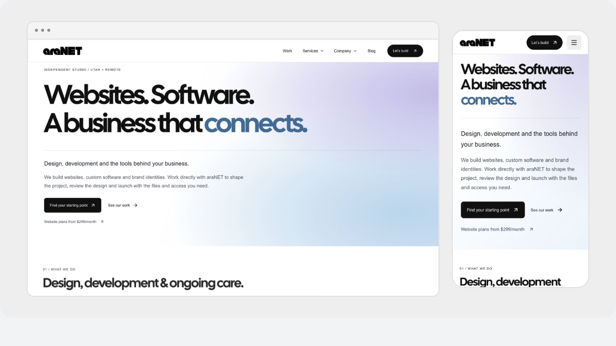
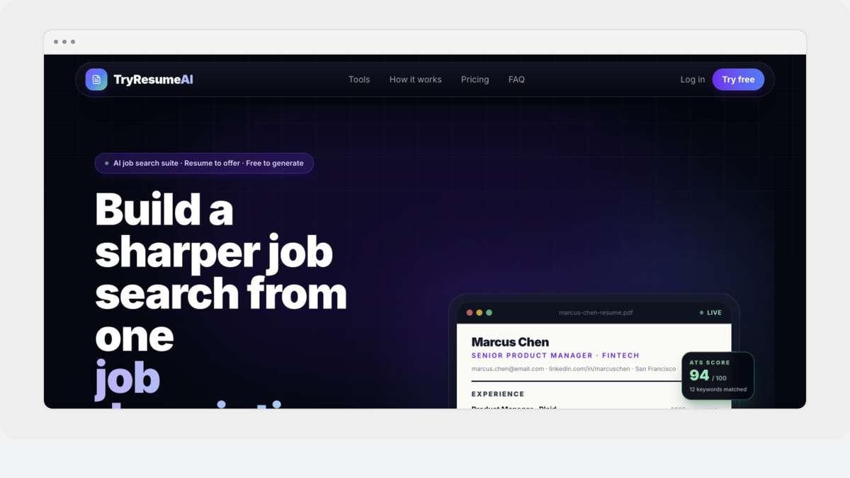
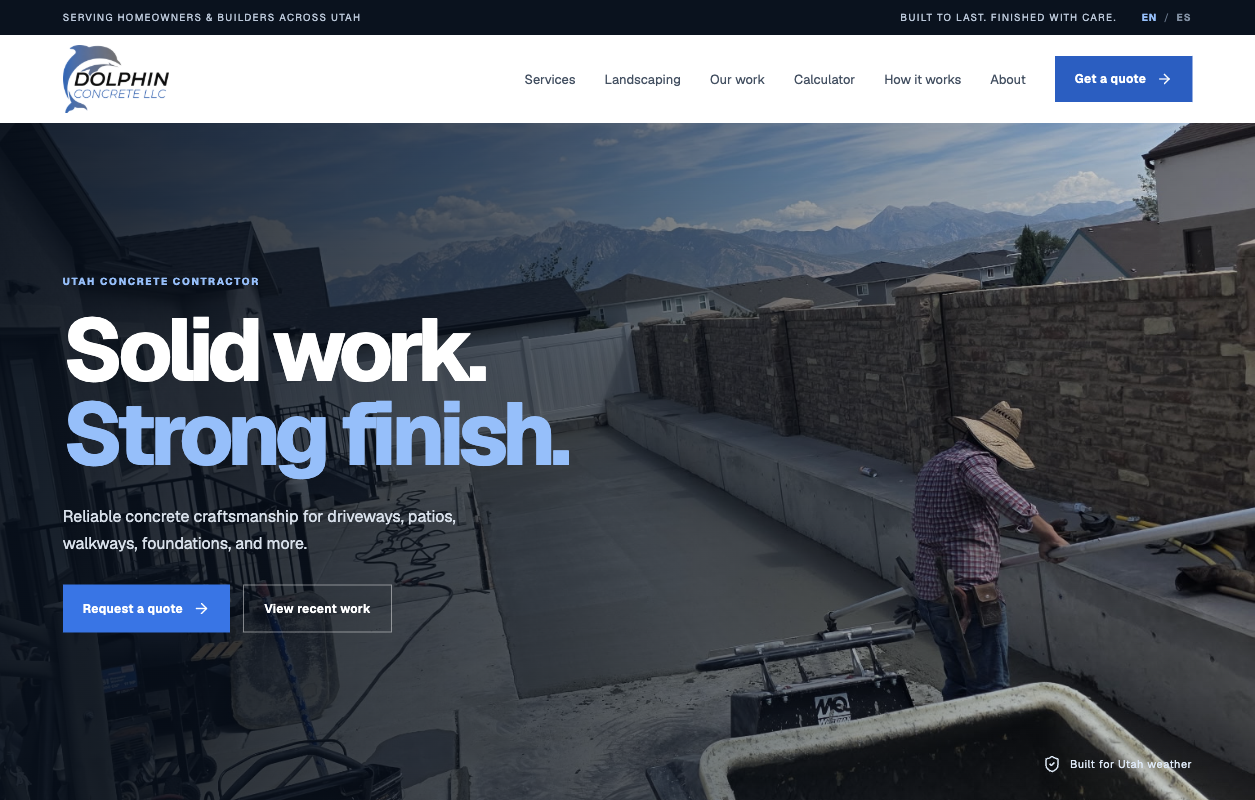
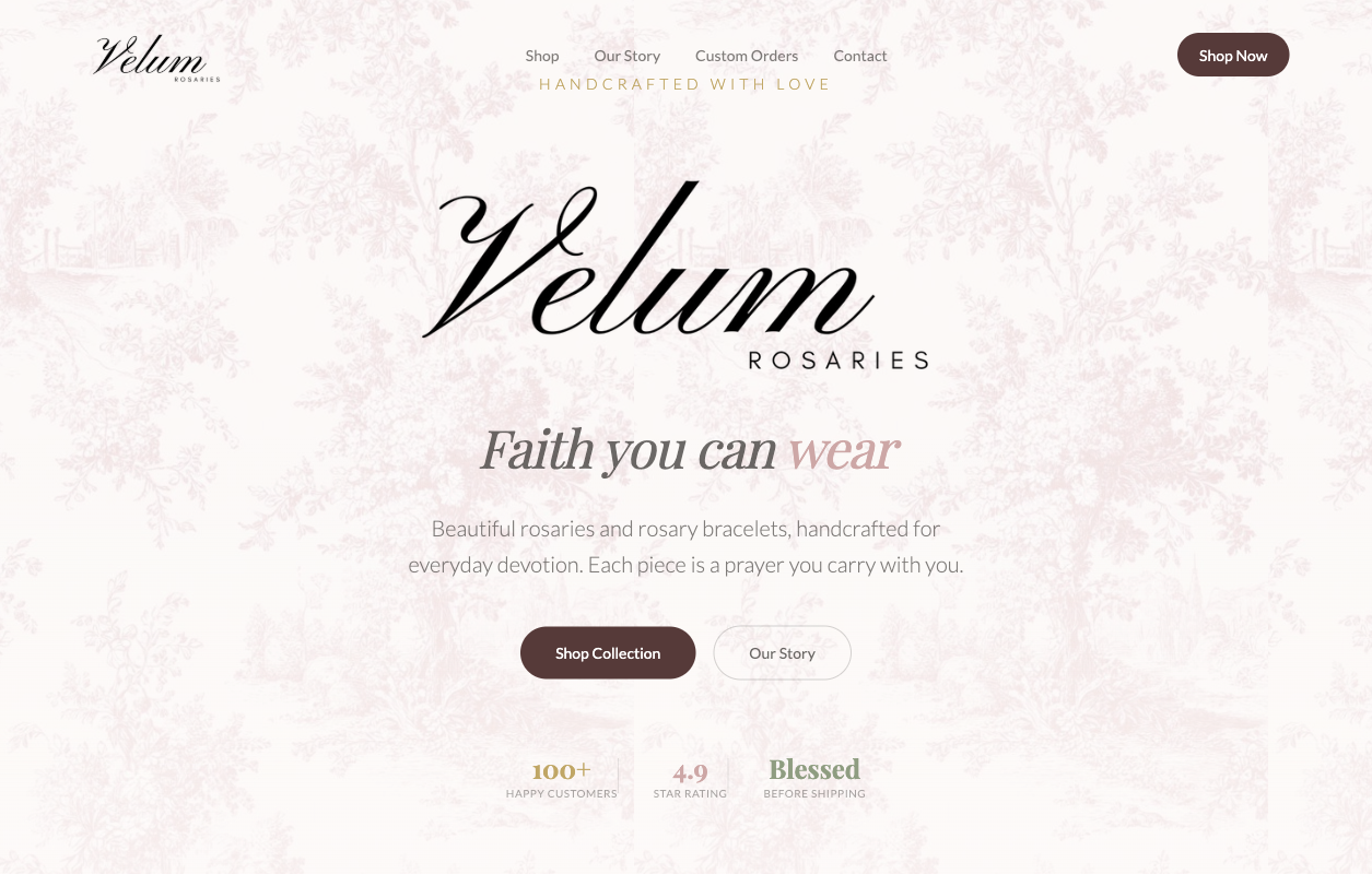
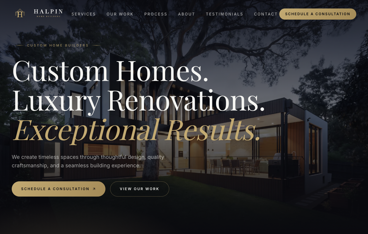
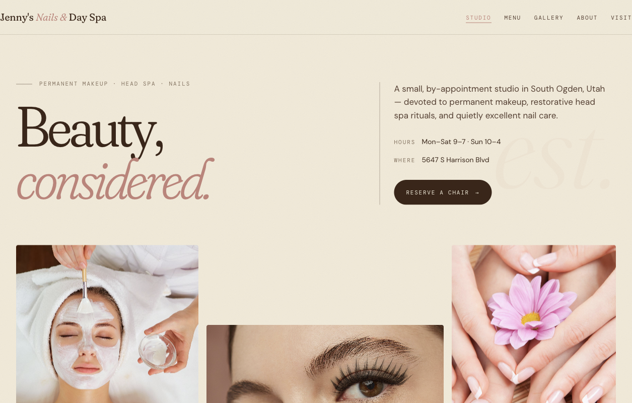
The October 15 araNET gallery release replaced recreated website compositions with unmodified homepage captures. Dolphin Concrete, Triple F Framing, Vocara, TryResumeAI and Gente X joined the retained Grief Empowerment, Velum Rosaries and araNET captures. The owner-selected Halpin Homes and Jenny’s Spa previews replaced the earlier sample concepts.
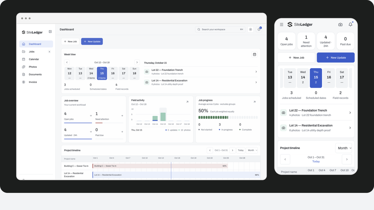
The point is straightforward: if we are showing a website, readers should be able to see that website’s own layout, typography and identity. The capture carries the original page pixels rather than a second marketing headline or a manually reconstructed logo.
Why a screenshot is more useful here
A portfolio tile has limited space. Rebuilding every project into the same house style can hide the differences a prospective customer is trying to judge. A real capture makes the design choices more visible: the page’s information hierarchy, how it presents the offer and the relationship between its images and type.
Compare the two lead examples. Dolphin Concrete places a construction photograph beside its blue service headline and quote route; the page makes the kind of work visible before the visitor enquires. Velum Rosaries uses a script identity and lighter botanical composition around its retail presentation. Their type, image density and tone serve different subjects. Keeping the original pixels lets a reader judge those choices instead of seeing both projects forced into araNET’s own black-and-white identity.
The shared browser frame gives the examples a common place in our gallery. It groups the work without repainting it. A screenshot is still a dated view: follow an available website preview to judge interaction, and use the saved image to inspect the captured design.
Built work and saved previews are not the same claim
Halpin Homes and Jenny’s Spa are labeled as previews. Triple F Framing and Gente X link to saved full-size captures rather than implying a fresh public deployment. Triple F’s public site remains paused. Where placeholder imagery is present, the caption says so. This gallery update did not publish or redesign those client sites.
Those labels help a reader interpret the work. They also keep a portfolio refresh separate from a client launch announcement. We are not attaching invented results or endorsements to the images.
How to review the examples
- Look at how quickly the page explains the business and its audience.
- Compare the prominence of the main action with the information needed before taking it.
- Ask which elements belong to the client’s identity and which are interface conventions.
- Use the preview label to understand whether you are seeing live work, a saved capture or a concept.
The gallery continues moving on pointer hover, with keyboard-focus and reduced-motion behavior retained. If an example suggests a direction for your project, bring the specific detail you noticed. A useful design conversation starts with what the example helps a visitor understand or do, not just its color palette.