SiteLedger focuses on the connection between construction field operations, project evidence and closeout. A field update and an office review refer to the same job, but they are different tasks. The public desktop and mobile demos make that difference visible through fictional jobs and sample records.
A useful operations screen should help someone find the right job, understand what needs attention and reach the supporting information. More information is not automatically more clarity. The design question is which details help the person make the next decision, and which can wait until they open the project.
Follow the information, not just the dashboard.
01
Find the job
Use a recognizable project context so a summary or field record belongs to the right piece of work.
02
Check the evidence
Read the activity and supporting details behind a status instead of relying on a number alone.
03
Review what comes next
Bring the week view and timeline into the review so progress has a place in the broader job.
Inside the decisions.
Two screens, different priorities.
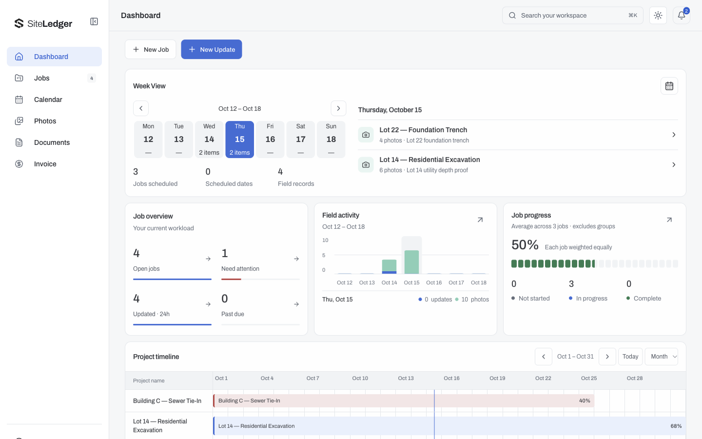
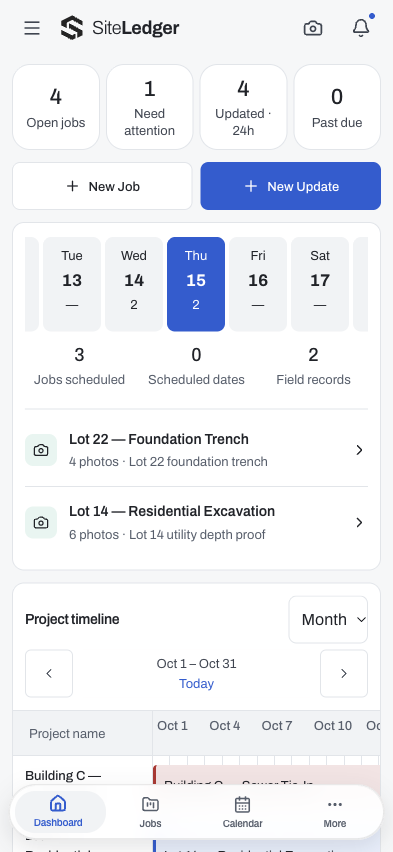
The desktop capture makes room for job overview, week view, field activity and a project timeline. The mobile capture gives the same context a narrower reading order. It is a different arrangement of priorities, not a desktop dashboard reduced until it fits.
A summary needs a way back to its source.
Counts and status indicators are useful starting points, but the record behind them matters. The story is about the path from overview to evidence. When evaluating this kind of product, ask what supports a status and who should be able to change it.
Show realistic work without exposing a job.
The public captures use purpose-built sample records. They show enough variation to explain the interface while keeping customer names, operational details and financial records out of the portfolio. The Structural S mark stays consistent across the product context.
Clarity starts with one real workflow.
Start with a job and the people who touch it. Map what gets recorded in the field, what the office reviews and what closes the loop. That workflow gives the interface a reason for each summary, record and next action.