Introduction
We updated the SiteLedger website on October 22, with more detailed plan cards and a closer connection between the product’s identity and its crew illustrations. The work focused on the public website: helping someone understand the options before they start signing up.
A desktop view of the working week
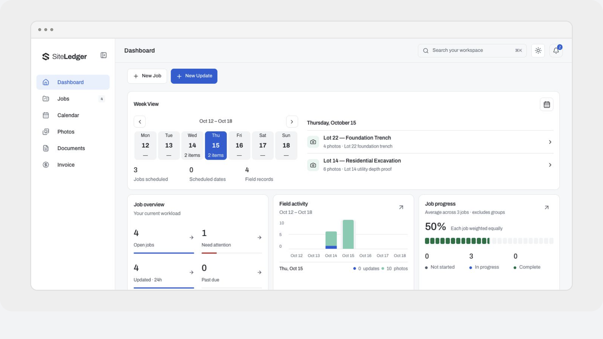
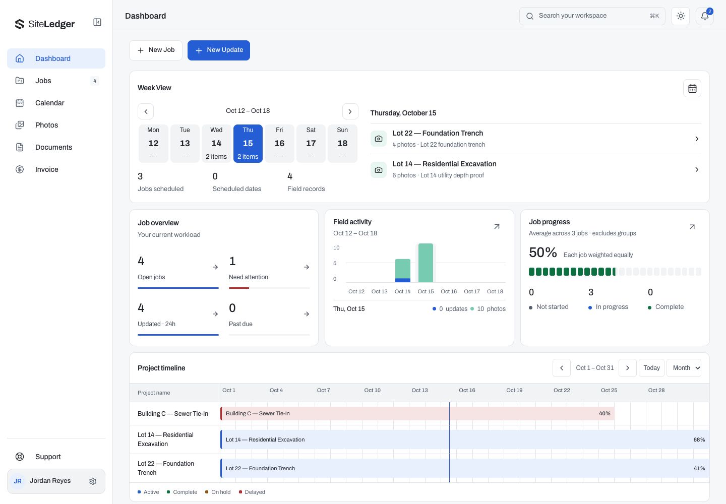
SiteLedger’s dashboard brings scheduled work, field records and a job overview into one screen. The desktop capture shows open jobs, work needing attention, recent updates and a project timeline. These are example records, not results from a customer’s business.
The timeline sits alongside the activity overview so someone planning the work can compare dates and progress without treating a job list as the whole picture.
Keep jobs and lots together
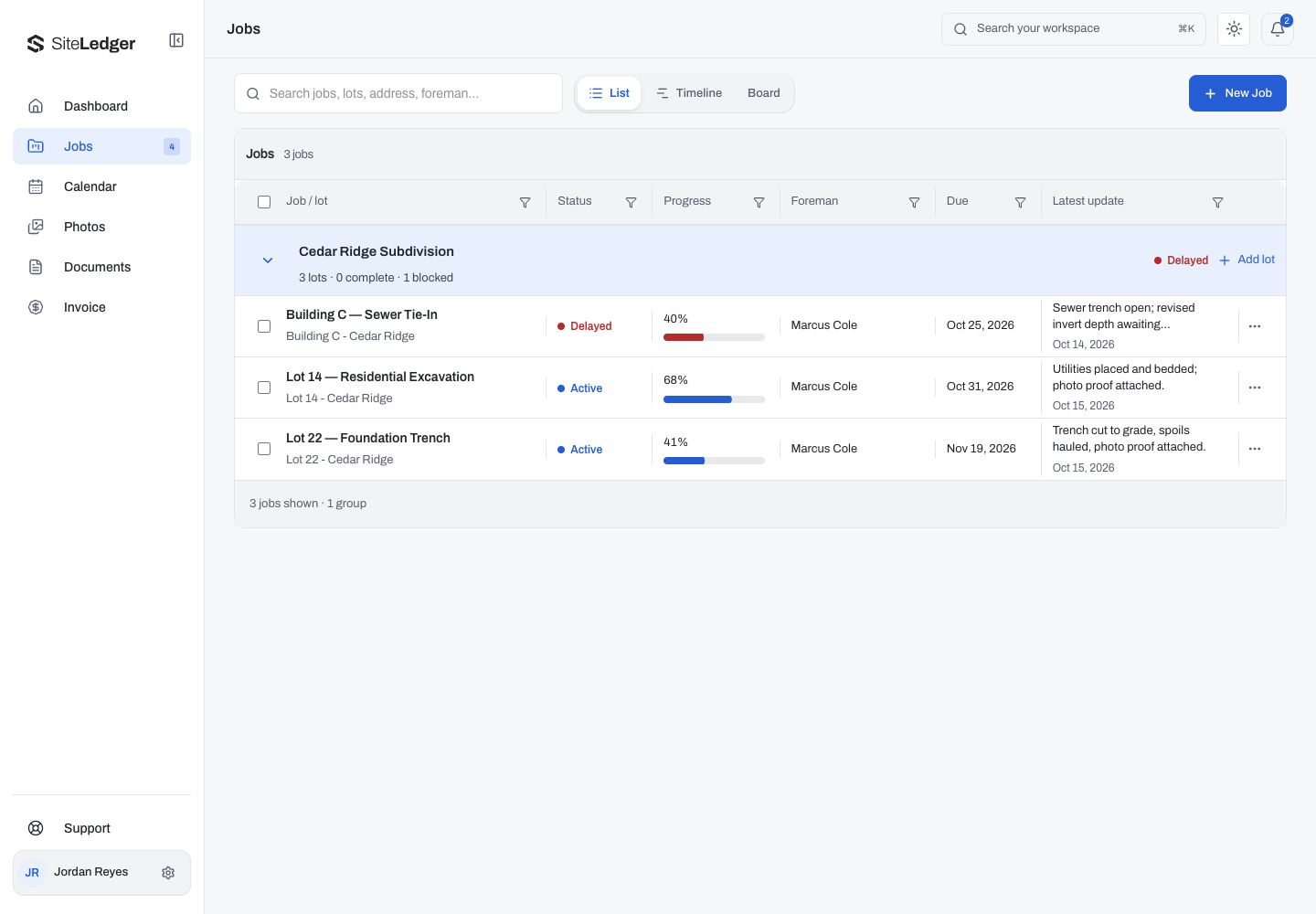
The Jobs view groups related lots under their project. In the example shown, Cedar Ridge Subdivision contains individual excavation and trench jobs, with status, progress, foreman, due date and the latest update visible in the list.
List, timeline and board choices give the work different views. Grouping the records keeps the overall project visible while preserving the details of each job.
Take the field update onto a phone
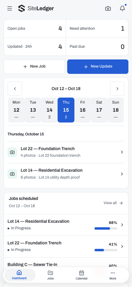
The mobile dashboard puts open jobs, attention items and the weekly schedule above the job list. New Job and New Update actions sit close to that overview, with navigation along the bottom of the screen.
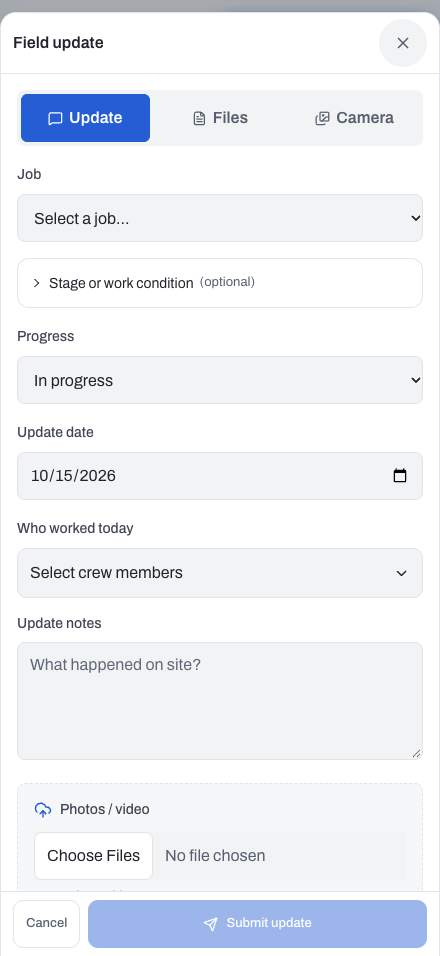
The field-update form connects a report to a selected job. It includes progress, update date, crew selection, written notes and a photos/video attachment field. Those details give a field record context: which job it belongs to, who worked on it and what happened on site.
Keep supporting records close to the work
The existing SiteLedger website also presents project documents, job-linked photos, invoices, rentals and purchase orders as part of the workspace. The screenshots here focus on the dashboard, jobs and field updates; they do not demonstrate every supporting workflow.
These are existing product capabilities being explained through the refreshed website, rather than features introduced by the October 22 design release.
Bring the identity into the artwork
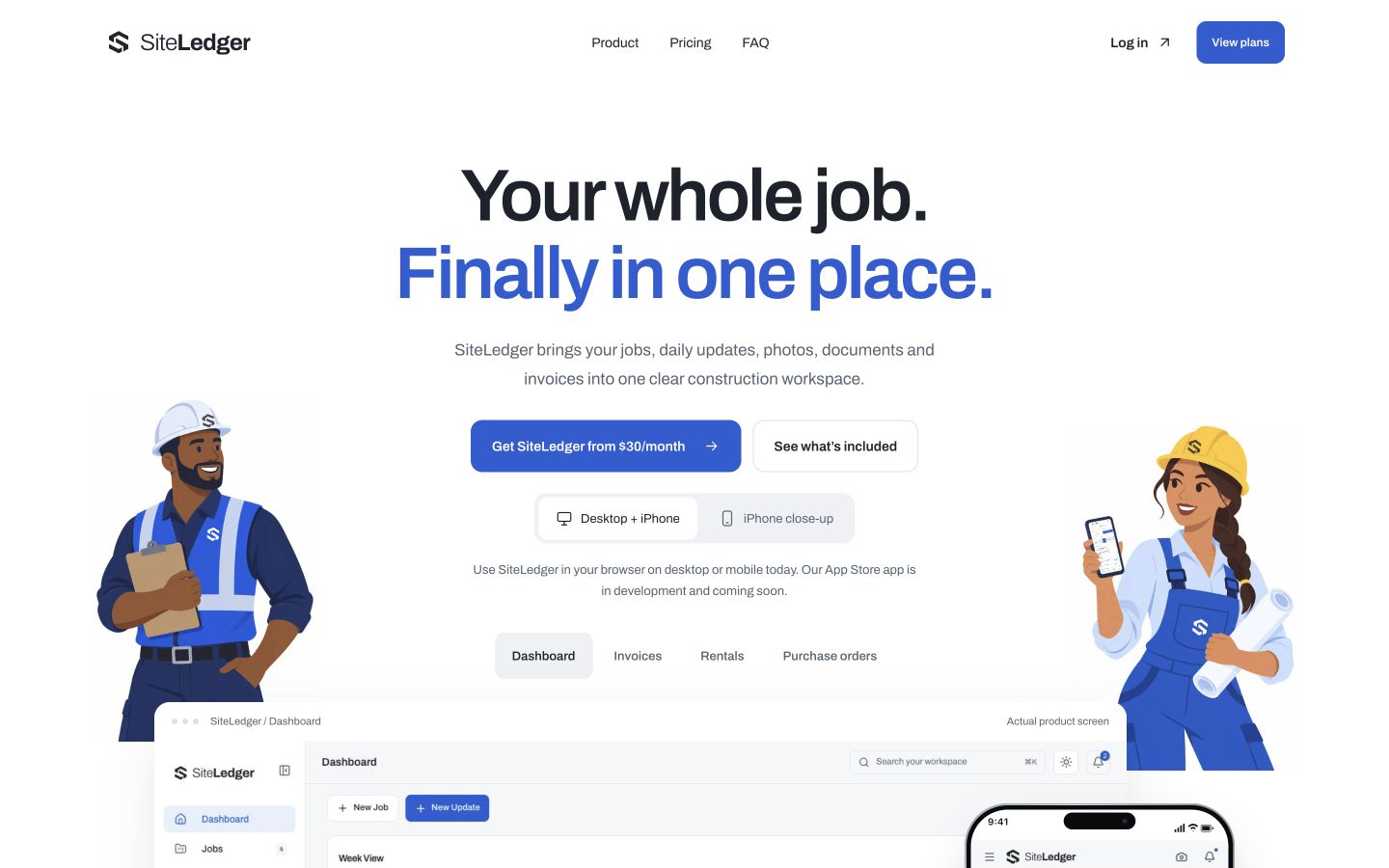
The crew illustrations now carry SiteLedger’s own marks on the hard hats, clothing and supporting artwork. We kept the approved illustrations and animation, then adjusted the placement of the marks within them.
Some of that work was small: centering a helmet mark, fitting another inside the engineer’s overall pouch, and checking that each placement still read at phone size. Those details helped the artwork feel like it belonged to SiteLedger.
Make the plan choices easier to read
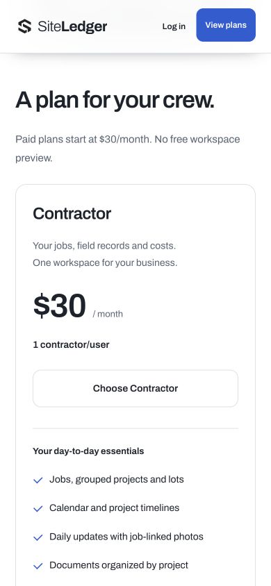
The revised pricing cards spell out the differences between Contractor, Team and the individually scoped Enterprise option. The hero introduces the starting price, while the cards carry the fuller plan information. The buttons no longer repeat the price.
We also checked where those buttons lead. The Team action opened the existing signup flow with the matching plan selected. That was a navigation check; we did not submit an account or run a payment as part of this website review.
Review the page where people will use it
The release review covered the desktop artwork and the settled mobile layout. At the checked phone width, the page and pricing cards stayed within the screen, and the plan actions retained their touch-target height.
The final release also passed the project’s type, test, build and accessibility checks. Those checks support the website release; they do not establish that every device or customer workflow has been tested.
Keep the website work separate from product claims
This update changed SiteLedger’s presentation. It did not introduce new signup or billing behavior, change customer records, or establish a gain in productivity.
For araNET, the useful part of this work was making the first steps more consistent: the artwork, the plan explanation and the route into signup should all describe the same product.