Introduction
We’re building a client workspace for the part of a project that happens between the first brief and the final handoff. Clients can open their project, see the current stage, review the work and find the files we’ve shared with them.
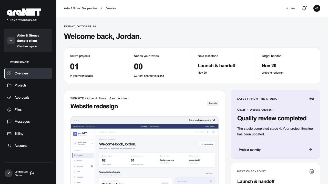
It’s in private review. The screenshots below use Alder & Stone, a fictional customer project, so we can show the working interface without showing anyone’s business records.
Start with the project, not a list of tasks
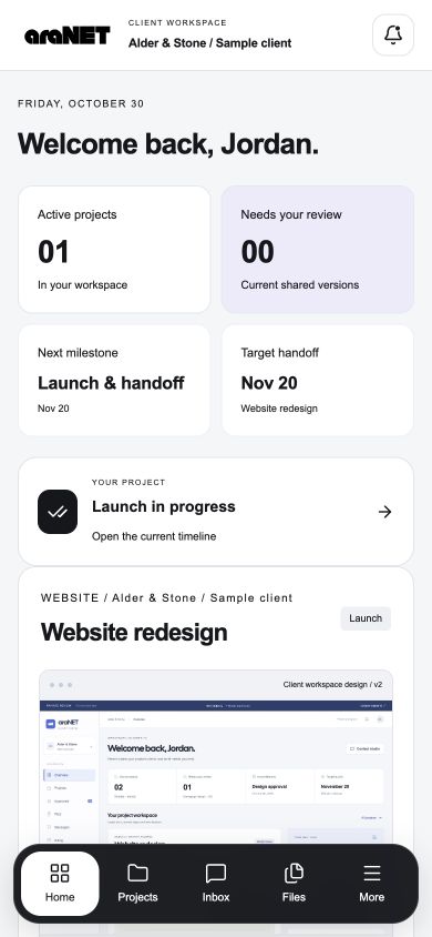
The overview answers three questions: where is the project, what has changed and what needs a decision?
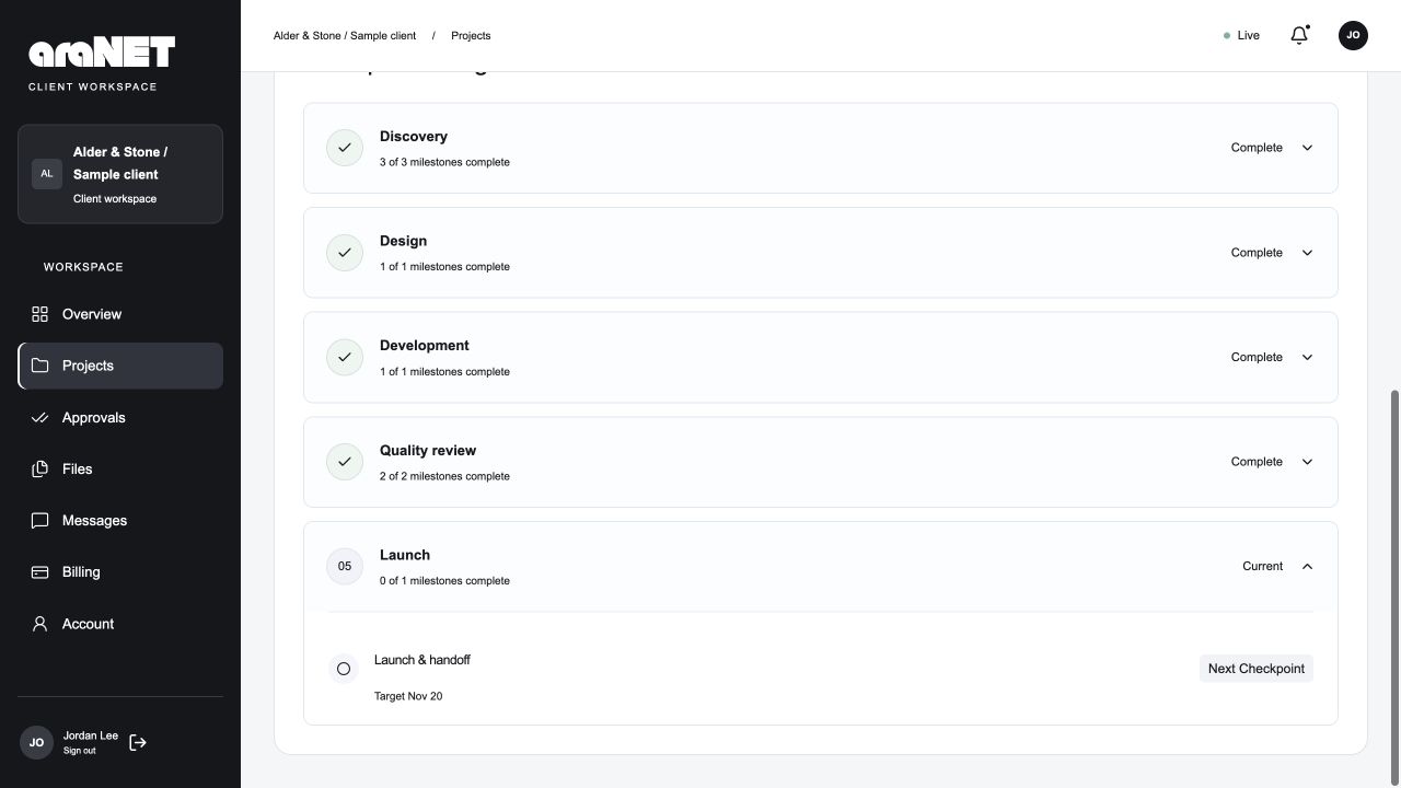
The main project card shows its latest shared preview, completed milestones and target handoff. Beside it, the latest studio update and next checkpoint give that progress some context. A client can open the project for the full brief, timeline, files and activity.
The percentage comes from completed milestones. In the recorded October 29 fictional-customer browser check, saved Studio completions appeared in an already-open client overview with persistent in-app notifications. That check established automatic saved-state updates; it did not isolate the delivery mechanism or establish reconnection behavior. The progress figure represents recorded milestones rather than elapsed project time.
Point to the part of the website you mean
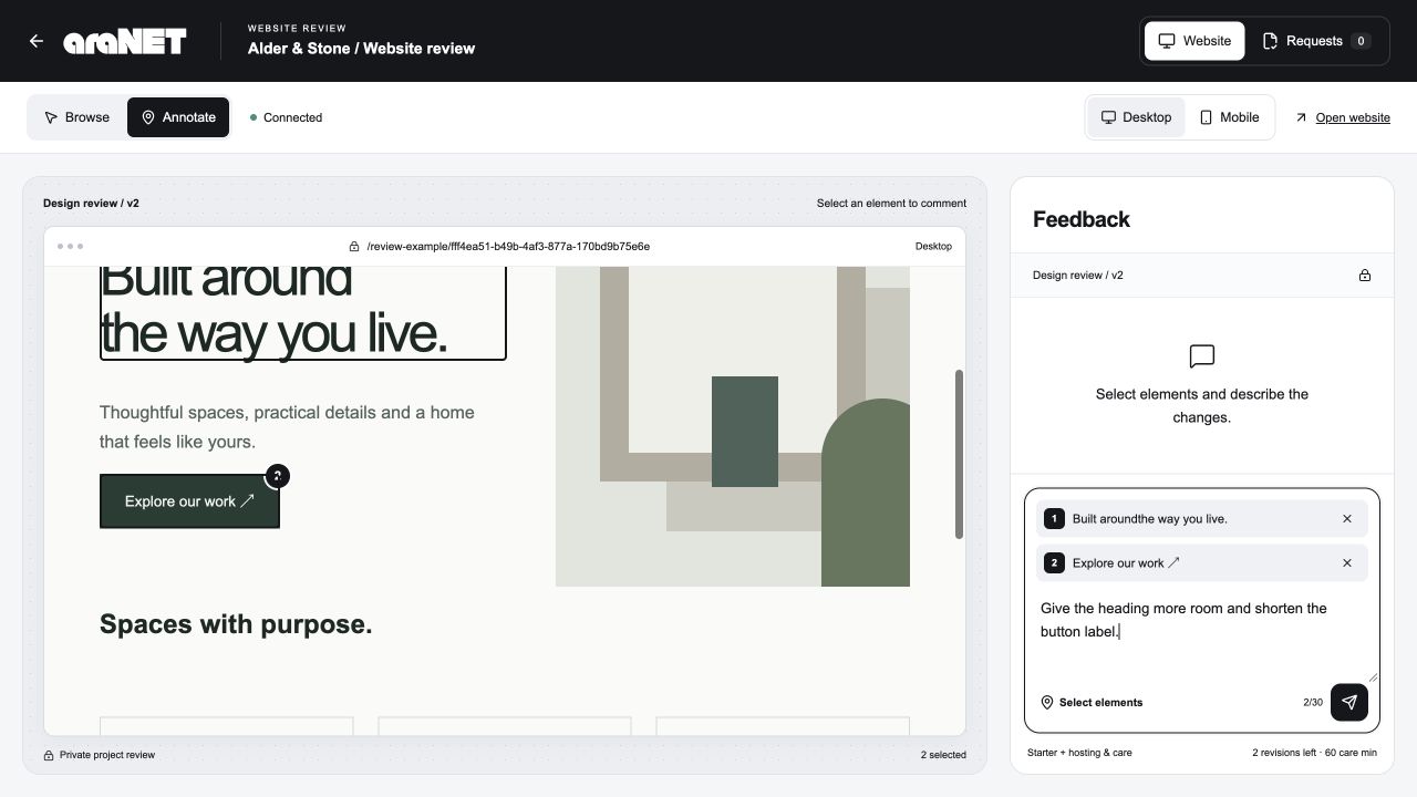
Open the website review and use Browse to follow the page as a visitor would. Switch to Annotate when there’s something to change.
Select a heading, button or another element. Each selection becomes a numbered attachment. You can keep selecting, remove a target and write one message about the group. A comment about the whole page can be sent without selecting an element.
For example: select the heading and its button, then write, “Give the heading more room and shorten the button label.” The request keeps those targets, the page and the reviewed version together. We receive that same request in Studio, with the description shown once beside the selected elements.
That makes the feedback specific enough to act on without asking a client to describe where something sits on a long page.
Agree the change before work starts
Submitting feedback puts it into the review queue. We scope the request against the agreed project: it might use a design revision round, an ongoing allowance or a separate quote.
The client can review the proposed work and estimate before approving it. Approved requests can move into progress and then completion, with the result retained against the project. Selecting an element or sending a comment does not itself approve extra work.
Keeping those steps visible gives both sides a record of what was requested and what was agreed.
- 01Submitted
Your message + selected elements
- 02Scoped
We explain the work and allowance
- 03Approved
You review the proposed change
- 04In progress
The studio works on the request
- 05Completed
The result stays with the project
Find the file and download what you need
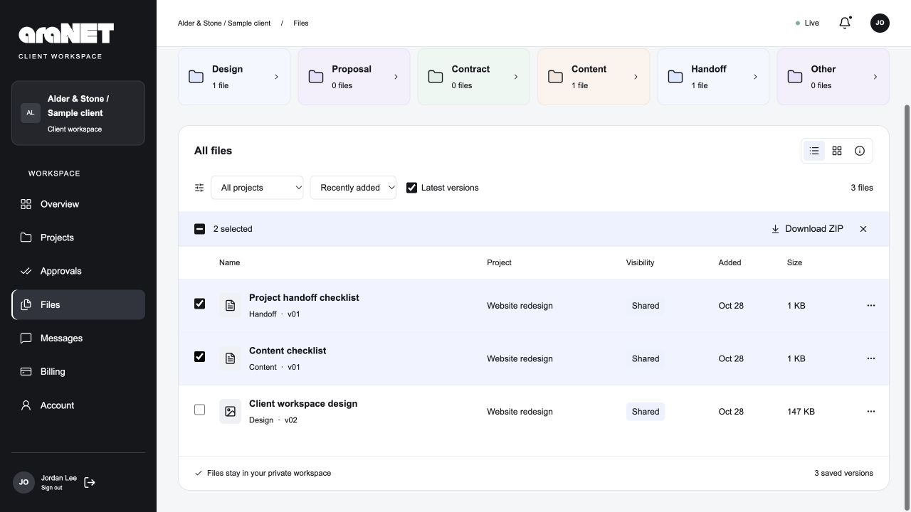
Files works as a project drive. Collections separate design, proposal, contract, content and handoff documents. Search and project filters narrow the list; the latest-version option helps avoid opening an earlier revision by mistake.
Open a file to preview it, or select the files you need and download them together as a ZIP. The list shows the project, version, date and size, so the choice has more context than a filename alone.
The client view contains shared files. Internal drafts remain in Studio until we choose to share them. At handoff, the same drive can hold the agreed final assets and instructions.
Keep the conversation with its project
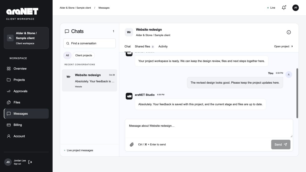
Messages has a conversation for each project, with shared files and activity available alongside the chat. A question about the build stays attached to that build when a customer has more than one project with us.
Website change requests have their own review record. General questions belong in Messages. Keeping the two distinct lets a conversation stay natural while a requested change keeps its targets, estimate and decision.
A phone gets its own arrangement
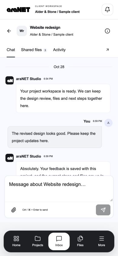
On a phone, a floating bottom dock replaces the desktop sidebar. The project overview becomes a single column, and conversations open into a focused chat view.
The review tools follow that pattern too. Select elements on the website first, then open Feedback to write. The feedback sheet can return you to selection without losing the message. It doesn’t open the keyboard after every tap on the page.
Short transitions show a panel opening, a saved update arriving or progress changing. Reduced-motion settings remove that movement. Black text, white work areas and restrained colour keep the project information readable across both layouts.
What we’re reviewing next
The October 30 private review covered consecutive element selection, one shared feedback message and the matching Studio request in a separate session. At a 390×844 browser viewport, the reviewer could return from the feedback sheet to selection without losing the message or targets. Separate route and file/download checks passed for the fictional fixture. Those checks did not include physical-device keyboard or Safari acceptance; wider-rollout readiness is a separate decision.
Billing currently presents shared records; online payment collection and contract signing are separate connections, not features implied by these screens. We also haven’t measured a reduction in emails or project time.
The aim is practical: when a client opens their project, they should be able to see the current work, understand the next decision and find the material they need.