Introduction
A desktop dashboard gives someone room to compare work. A phone needs to make the next action easy to find. When we look at those screens together, the question is where each task belongs and how much information it needs.
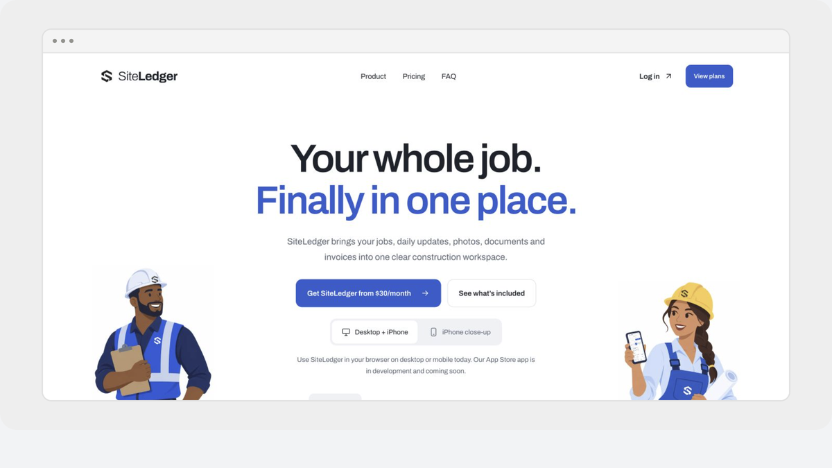
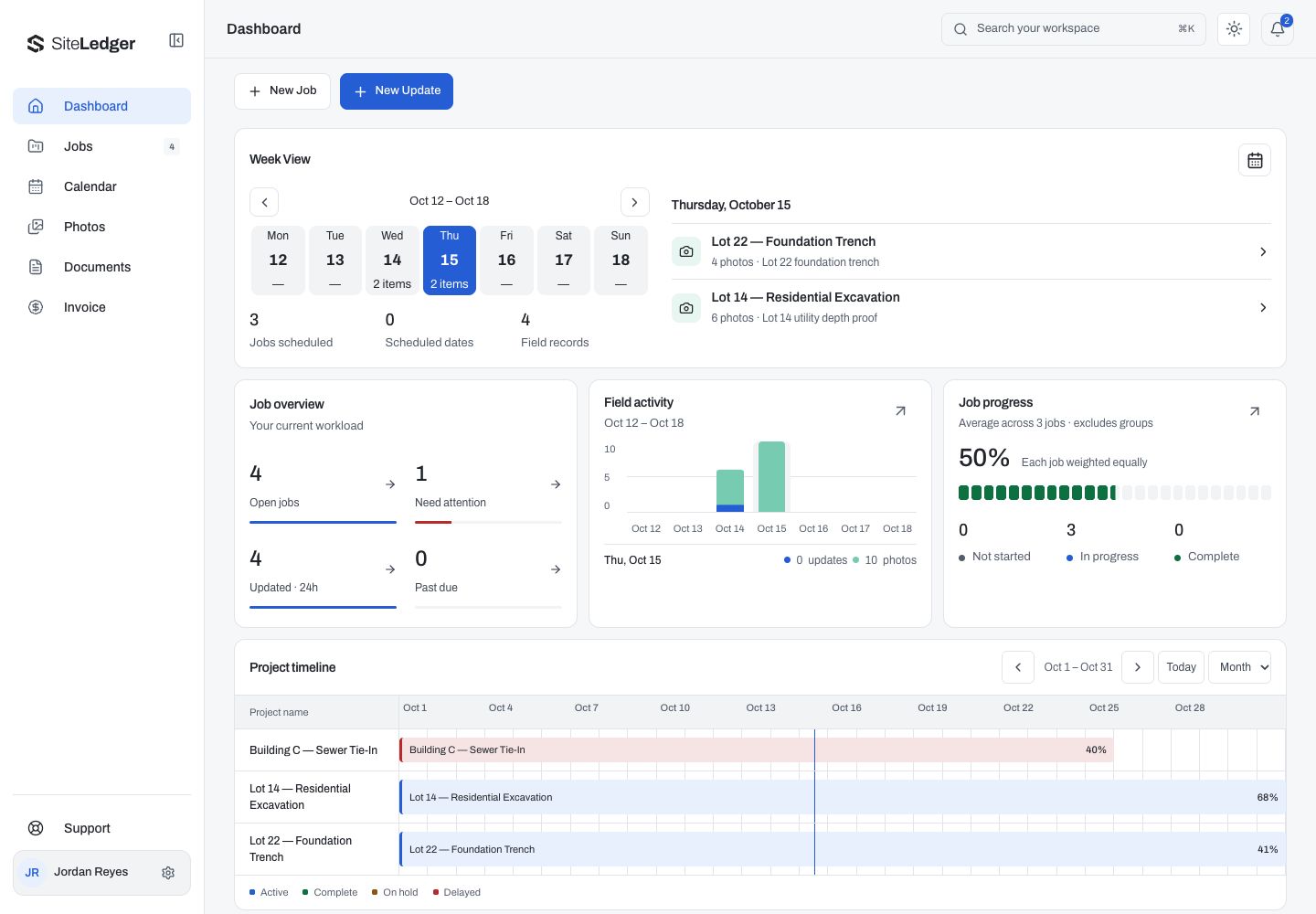
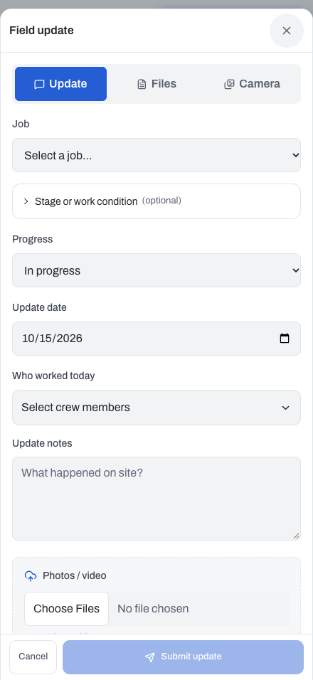
The SiteLedger screens in our recent website update give us a useful example. The desktop dashboard shows a job overview, activity and a project timeline. The mobile field-update screen concentrates on reporting against a selected job. These are existing demonstration captures with example records, not a new feature announcement.
Give planning room to compare
On the desktop dashboard, the weekly overview and timeline can sit together. That relationship matters: dates tell one part of the story, while recent activity and work needing attention tell another.
The design question is which pieces someone needs to compare before deciding what to do. If those details sit too far apart, the reader has to remember one view while opening another. If everything gets equal visual weight, the dashboard becomes harder to scan.
For a planning screen, we would start with the decisions: what is scheduled, what needs attention and which job needs a closer look. The layout should make those comparisons possible before asking someone to open a record.
Give reporting a clear subject
A field update needs a different starting point: which job is this report about?
The existing mobile example includes job selection, progress, an update date, crew selection, notes and an attachment field. Those fields connect an update to its work. A photograph without a job or a date asks the next person to reconstruct the context.
Use each visible field to define a reviewer’s decision and a failure case. This is a proposed information contract for a field-update form, not a claim that the screenshot demonstrates its implementation:
- Job: tells the reviewer which work the update belongs to. If assignment changes, recheck access before accepting the update instead of silently attaching it elsewhere.
- Progress: communicates the reported state. Define the scale and how it affects the job; a percentage without that definition can mean different things to the field and office.
- Update date: separates when work occurred from when a report was received. A delayed submission should retain that distinction.
- Crew: identifies the reported participants. Check that the choices belong to the permitted project rather than exposing an unrelated team.
- Notes: explain what happened and what needs attention. Ask a useful question rather than leaving a large unlabeled text box.
- Attachments: provide supporting evidence. Show whether each upload is pending, saved or failed; a written update should not imply that a missing photo arrived.
Before adding another field, name the person who needs its answer and the decision it changes.
Carry the context between screens
Desktop and mobile can arrange information differently while keeping the meaning consistent. The job name, status and dates should still refer to the same work.
For a project review, that gives us a concrete walkthrough: choose a job, prepare an update, then check where its information should appear for someone reviewing the work. We would check the successful path and the points where a missing job, unclear label or failed attachment could leave someone uncertain.
That is a test we recommend, not a claim that the screenshots prove the whole journey works. A capture can show hierarchy and visible fields. Saving, permissions and delivery need their own checks.
Review the task before adding another panel
For a business building its own software, a useful brief can begin with three questions: what does someone need to see, what do they need to do, and what should be clear when they finish?
Answer those for the person planning the work and for the person reporting it. The answers may lead to different screens. They should still describe one connected job.
Our recent SiteLedger website update, linked below, shows more of the dashboard, Jobs view and phone layouts. This note draws a design lesson from those examples; it does not announce another product release.