Start with the business, then the moodboard
A brand becomes useful when it helps someone recognize the business and understand what it offers. Before choosing a typeface, describe the service, the people it serves and the way the team communicates. A careful specialist and an energetic event company may need different visual decisions even if both request a modern website.
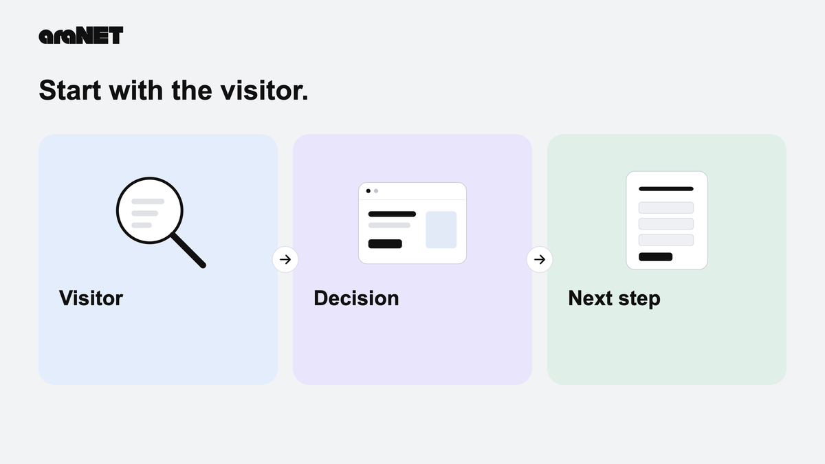
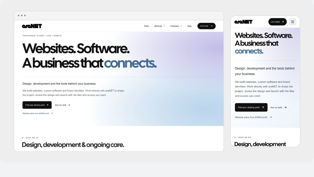
Our own website provides a concrete case. araNET presents websites, software and mobile development, and brand design. A visitor needs to recognize the studio, compare those services, inspect relevant work and start a useful conversation. The identity must support all four tasks.
Choose qualities with consequences. For this site, clarity means readable service descriptions and distinct onward links. Consistency means the same original marks and type roles across a homepage, service page and document study. Those are decisions a reviewer can inspect, rather than adjectives attached to a moodboard.
Audit what already belongs to the brand
Gather the real logo files, colors, photographs and existing usage guidance. Ask which pieces are established and which are open to change. Rebuilding a website does not automatically mean replacing an identity people already know.
araNET has a full horizontal wordmark and a compact aN mark, with original black and white masters. Their jobs differ:
- Full wordmark: use where the business name needs to be recognized. The website uses it in the desktop header and at the foot of the page.
- Compact aN: use for small recurring identity placements. The homepage sculpture develops that same geometry into contextual artwork; it does not replace the flat master.
- Light and dark versions: choose a readable treatment for the background while preserving the original proportions and paths. Do not type “araNET” in a similar font and call it the logo.
The Brand & Design examples show both marks on their intended backgrounds. The compact mark stays legible in a small square; the full signature has room to show the business name. Review each at the size where someone will actually see it.
For a client handoff, name the intended file for each use and include an example at its final size. Keep originals separate from application artwork. “Use the small logo” is less useful than a named master and an approved placement.
Build a small visual vocabulary
Select repeatable decisions with clear roles. On araNET, Cal Sans Regular carries expressive headings; Arial, Helvetica and the sans-serif fallback carry paragraphs, navigation, labels and controls. The wordmark remains original artwork rather than text set in Cal Sans.
The current website source makes the color roles equally specific:
- Paper, #FFFFFF: the main page ground, leaving the work and text room to breathe.
- Ink, #101010: near-black headings, primary text and dark actions. Neutral #656565 supports secondary copy; pale palette colors do not become paragraph text.
- Grey frames: #EEEEEE and #F4F4F4 group visual material, with #DEDEDE supplying quiet borders. A frame groups an example; it does not recolor the screenshot inside it.
- Website service tint, #E8F3FF: a pale blue background for selected website-service surfaces.
- Software service tint, #EEEBFF: a pale lavender background for selected software-service surfaces.
- Brand service tint, #FFEDE2: a pale peach background for selected brand-service surfaces.
- Sage, #D9DFD0: a supporting identity/application color, distinct from the service tints and neutral reading ground.
These are roles observed in the brand assets and current CSS, not a prescription to paint every section. A neutral image frame and a colored service panel can coexist because they do different jobs. Keep labels and headings understandable without asking the reader to memorize a color code.
Try the system on real copy. A long service name, an exclusion paragraph and a contact instruction expose different problems from a short poster headline. Preserve the type roles while adjusting the composition to the actual content.
Let the writing carry its share
Visual consistency cannot rescue vague content. Explain the offer in the words customers use, then describe what happens next. Replace “complete digital solutions” with the work being discussed: service pages, a shared operational workflow or a set of approved identity assets. Keep scope and optional ongoing care clear where they affect the decision.
The Brand & Design page applies our own marks to a social announcement, business card and document-cover study. These are original araNET application studies, not client commissions. They demonstrate consistent asset use across formats; the screen studies are not press-ready print files.
The same distinction matters in project imagery. Keep the original colors and proportions in actual website captures, and retain sample labels on fictional product records. The araNET work story connects the studio identity to service navigation and editorial structure without claiming a measured commercial result.
Judge the identity in use
Review a complete path before accepting the identity. Start on a phone, read a service description, inspect an example and find the contact route. Then check the matching document or social application.
- Read a real paragraph and a long heading at a small screen width; confirm neither needs the desktop composition to make sense.
- Inspect the smallest mark and the full signature on their intended backgrounds. Compare them with the original assets for distortion or missing detail.
- Check links, buttons and keyboard focus without relying only on color.
- Review grey frames, service tints and project imagery together: each should retain its own role.
- Check the static reading experience and the quieter motion setting.
Hand over the approved masters, font license where the font is supplied, color roles and actual application examples. Record who approves future variations. That gives the next editor a usable reference and gives the business a way to review the identity beyond the logo file.