Tenurea is live
TryResumAI is now Tenurea, live at tenurea.com as of October 17, 2026. We redesigned the identity, website and career workspace around a practical task: turn someone’s experience into material they can inspect, edit and prepare for an application. This updates our existing before-and-after story at the same address.
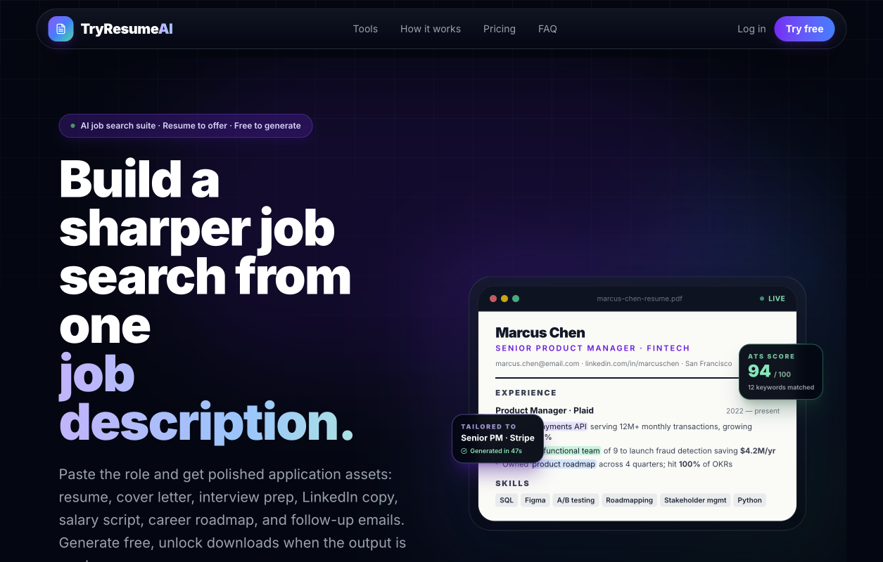
The images now compare the original October 15 homepage with the production website and public demo captured on October 17. All career details in the new captures are fictional samples. The earlier image remains intact as a record of where the redesign began.
Before: plenty of tools, competing for attention
The earlier page led with a dark purple background, a broad job-search headline and a résumé preview surrounded by supporting labels. Six tools introduced their outputs further down. The opening gave a visitor several things to interpret before they could understand the working experience.
Our design priority was to bring the task into focus. The introduction should explain what to prepare, show the document and make the next action easy to find.
After: the work gets the first impression
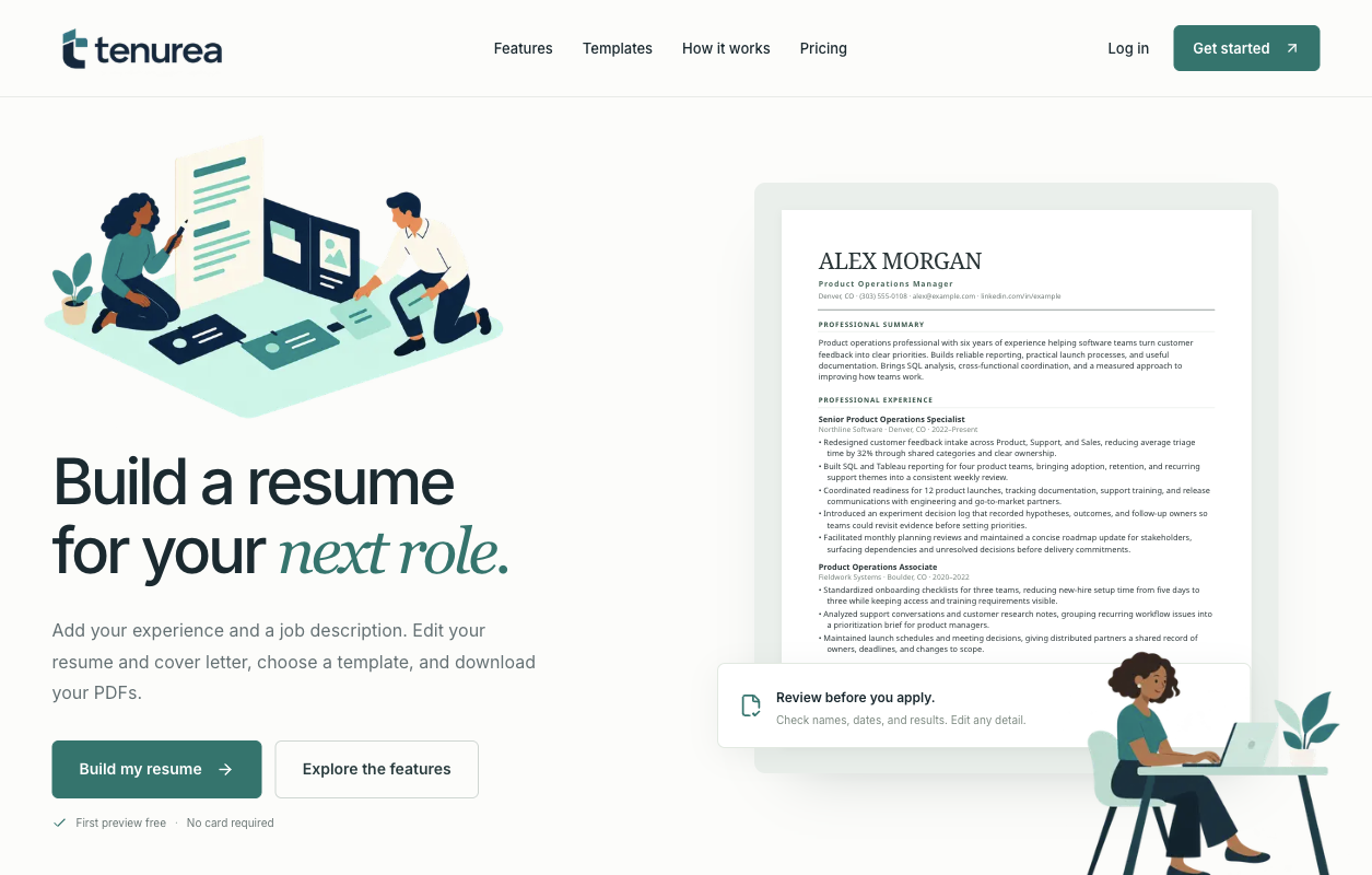
The live homepage uses an off-white canvas, dark ink wordmark and teal accents. A career illustration sits above a direct résumé headline, while a fictional Alex Morgan document gives the introduction a concrete example. Starting a résumé and exploring the features have separate actions. The first preview is free, with no card required.
The new mark, typography and illustrations carry through the page. Templates and the writing process have their own sections. A visible review reminder asks people to check names, dates and results before applying, making their responsibility part of the introduction.
Six tools, one career context
Tenurea’s current website presents six tools: résumé and cover letter, LinkedIn profile, follow-up emails, interview preparation, salary coaching and career roadmap. Together they cover preparation before an application and the conversations that can follow it. The résumé remains the entry point, with the surrounding tasks available in the workspace navigation.
For current access options and pricing, use the Tenurea website linked below. Keeping those details there gives readers a current reference as the product develops.
Inside: a document studio, not a one-shot answer
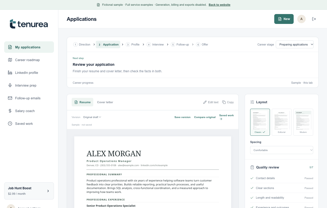
The document studio separates navigation, the draft and presentation controls. Résumé and cover letter share an application context. Editing, saving versions, reopening saved work and comparing the original keep revision close to the document. Classic, Modern and Editorial templates offer distinct typographic treatments of the same content.
A person can review the wording and presentation as separate decisions: choose a layout, return to the text and keep the application context in view. The desktop capture makes those controls visible beside the draft rather than burying them in another screen.
The screenshots come from the public /preview demo. It uses a fictional application and explicitly disables generation, billing and exports. Readers can explore the interface without treating the sample as a customer record or a demonstration of paid fulfillment. Quality and relevance checks support human review; the applicant must verify every fact.
On a phone: keep the task, change the arrangement
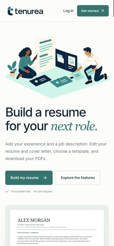
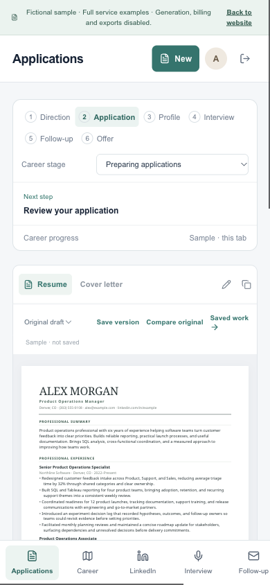
On the current mobile homepage, the illustration, headline and actions precede the document in one reading column. In the public mobile demo, application stages wrap, document actions sit above the draft and bottom navigation replaces the desktop sidebar.
These captures show two related tasks: understanding the product and working on an application. The arrangement changes with the available space while keeping the document readable and the next action nearby.
What the launch shows
Tenurea now connects its new identity to a live website and an inspectable career workspace. The screenshots show changes in hierarchy, navigation and document controls. They do not establish higher conversion, ATS success or hiring outcomes. The useful design lesson is to give people room to review and revise their work, with clear examples and honest boundaries.